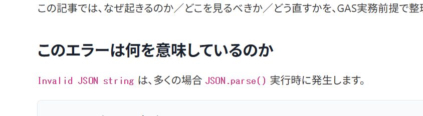
When using inline code like JSON.parse() or UrlFetchApp.fetch() in WordPress posts,
you may feel that it is somehow difficult to read, even though the contrast is sufficient.
We faced this problem at ZIDOOKA! as well, but the conclusion is that you can improve it sufficiently just by making it bold, without messing with colors or fonts.
In this article, we will organize the reasons and the minimal CSS solution.
Why inline code tends to be hard to see
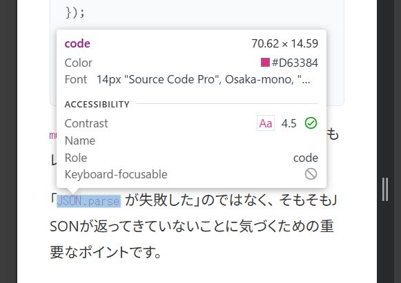
In many WordPress themes, there are the following assumptions for the code element:
- Font size is smaller than the body text (around 0.875em)
- Font weight is 400 (thin)
- It is colored, but the lines are thin and it sinks in the line
As a result,
Even though the contrast ratio is fine, only the code looks weak in the text.
This is a visibility issue, not an accessibility number issue.
Solution: Just make it bold
You don't need to change the look significantly or specify fonts.
Just increasing the font-weight greatly improves the perceived readability.
Recommended CSS (For inline code only)
p code,
li code,
td code {
  font-weight: 600;
}
That's it.
Why bold works best
- Changing color makes it stand out too much
- Adding a background makes it look like UI
- Font changes are highly environment-dependent
On the other hand, bold has the following advantages:
- Creates a natural contrast with the body text
- Hard to break even with a mixture of languages
- Stable effect on both smartphone and PC
Especially in the Windows + Chrome environment, the effect of font-weight: 600 is clear.
What you don't need to do
In this case, the following actions were unnecessary:
- Darkening the color
- Adding a background color
- Specifying a font family
- Overusing
!important
If the cause of "unreadable" is thinness, thickness is sufficient for the solution.
Summary
If you feel that inline code is difficult to see in WordPress posts, please try just the following line first.
p code { font-weight: 600; }If that is still not enough, then consider colors and backgrounds.
At ZIDOOKA!, we take the policy of Fixing with minimal changes, prioritizing readability in practice.
In this case, bold alone was sufficient.